Little Eden was a solo art show of a London-based Chinese artist, Zhichu Cheng, occurred in Shanghai from Aug 28 to Sept 18, 2018. I took part in her art exhibition as the visual designer for developing branding and promotional materials.
role
Ideation
Visual Identity
Graphic Design
Illustration
tools
Adobe Illustrator
Adobe Photoshop
Sketchbook
end products
event posters (in English and Mandarin)
invitations (in English and Mandarin)
postcards
catalogue
banner
process
Bold. Authentic. Playful.
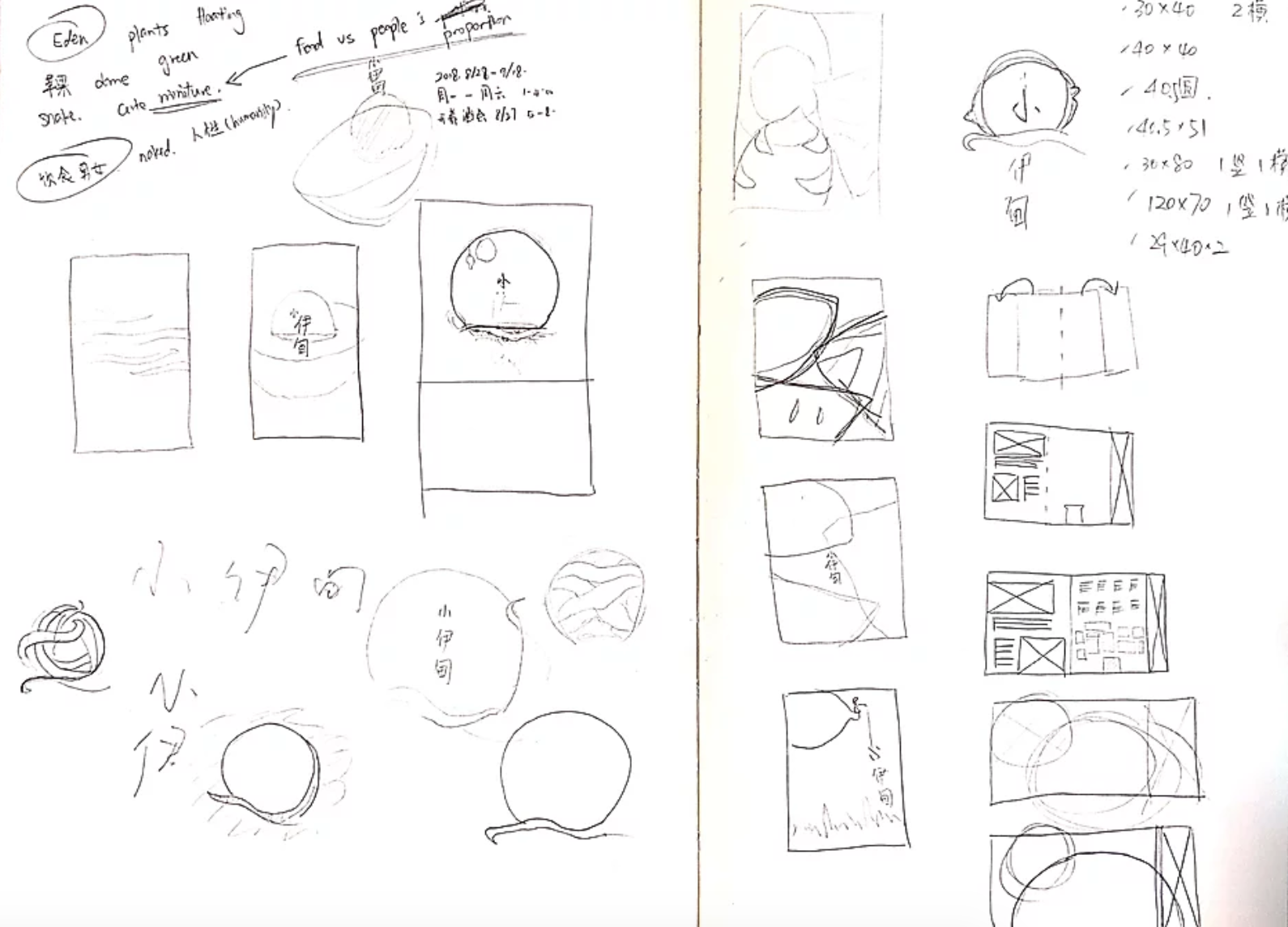
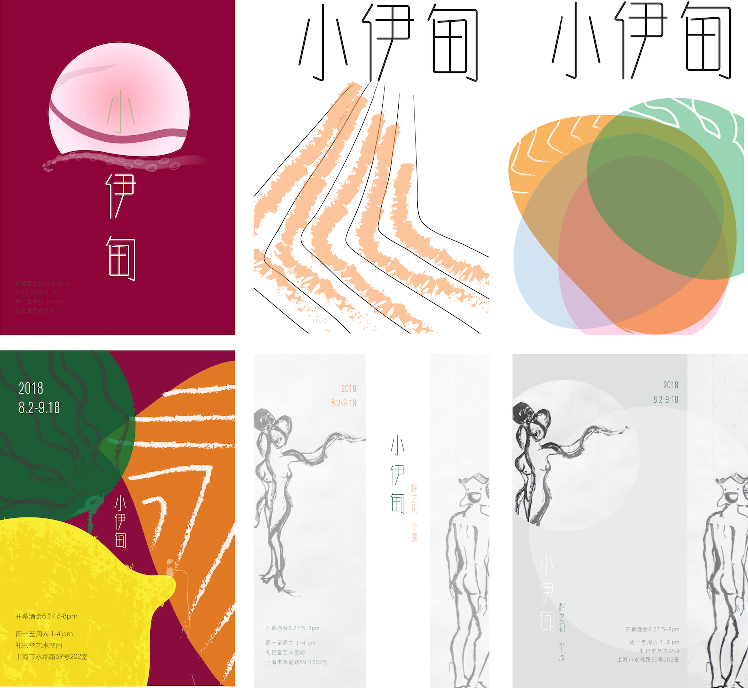
The project started with creating a branding/visual identity for the exhibit and a set of event posters that reflect the artist’s style and personality. I asked the artist to join me in the initial brainstorming session to better understand her personality. We wrote down keywords and sketched out some initial concepts. I then experimented with different visual styles through more sketches and digital mockups.
Ideation with pen and paper.Poster design rough mockups.
final design
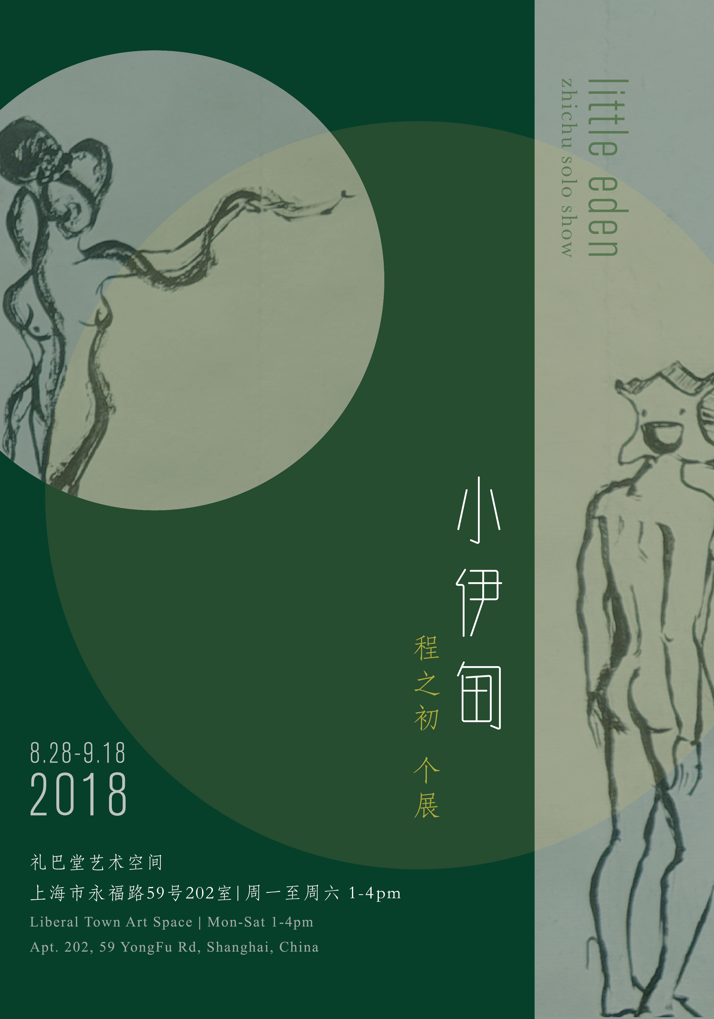
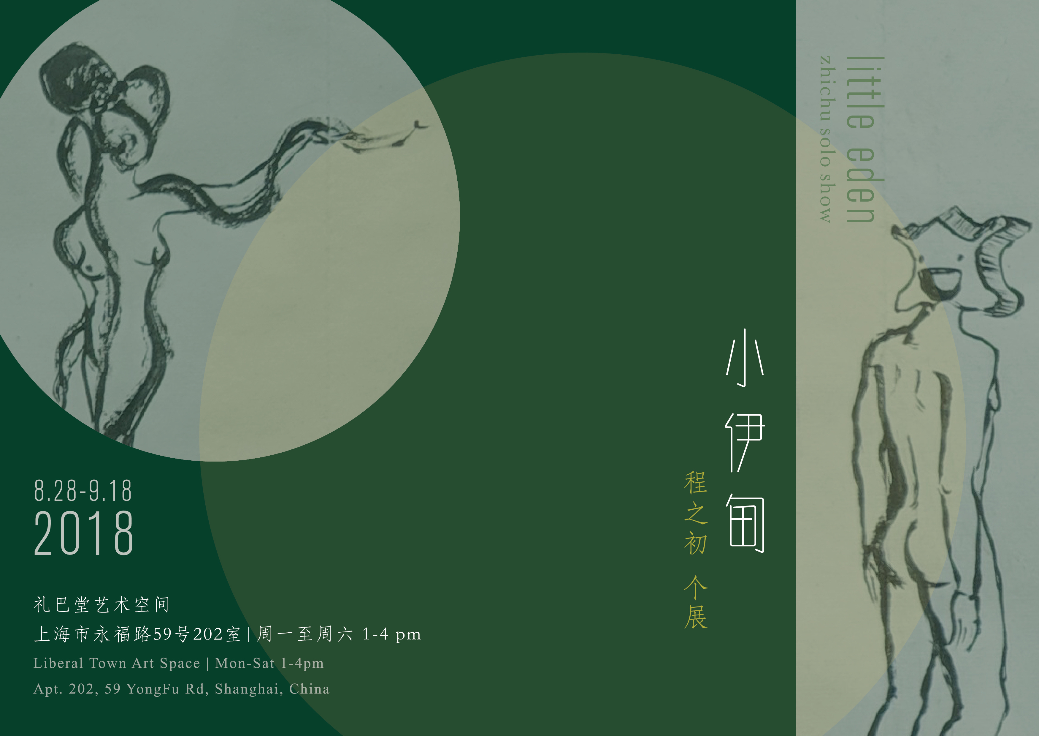
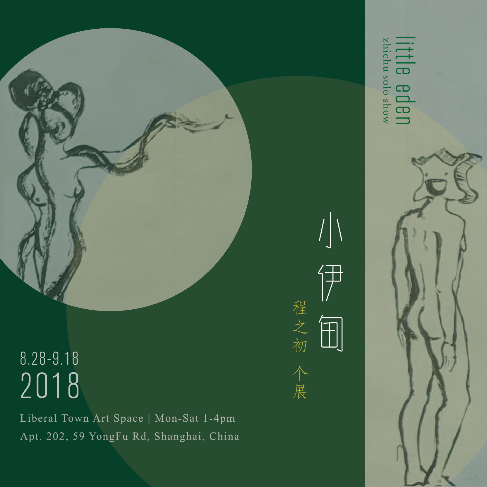
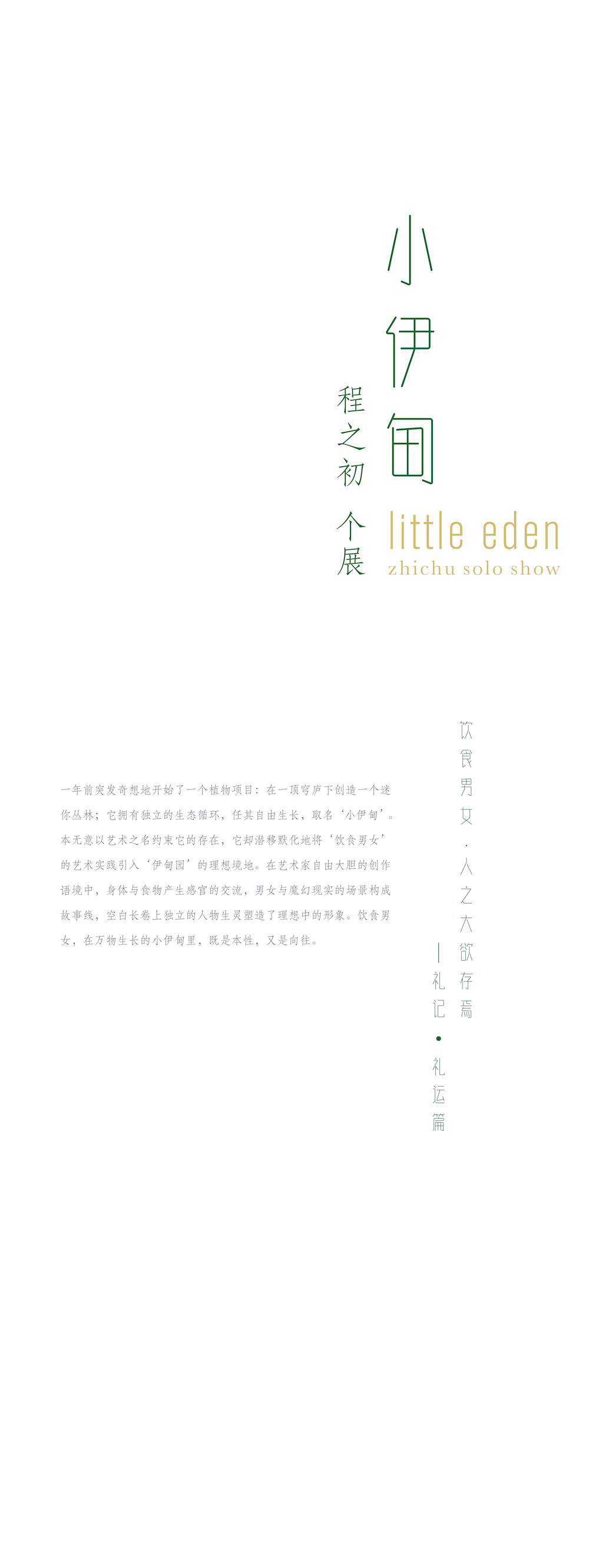
Posters
Incorperating the artist's sketches, the final design concept reflected the show’s theme and the artist's personality.
Banner
A floor to ceiling banner by the entrance of the exhibition, containing a foreword by the artist.
Final Design of the banner.A photo of the printed banner at the exhibit.
Catalogue
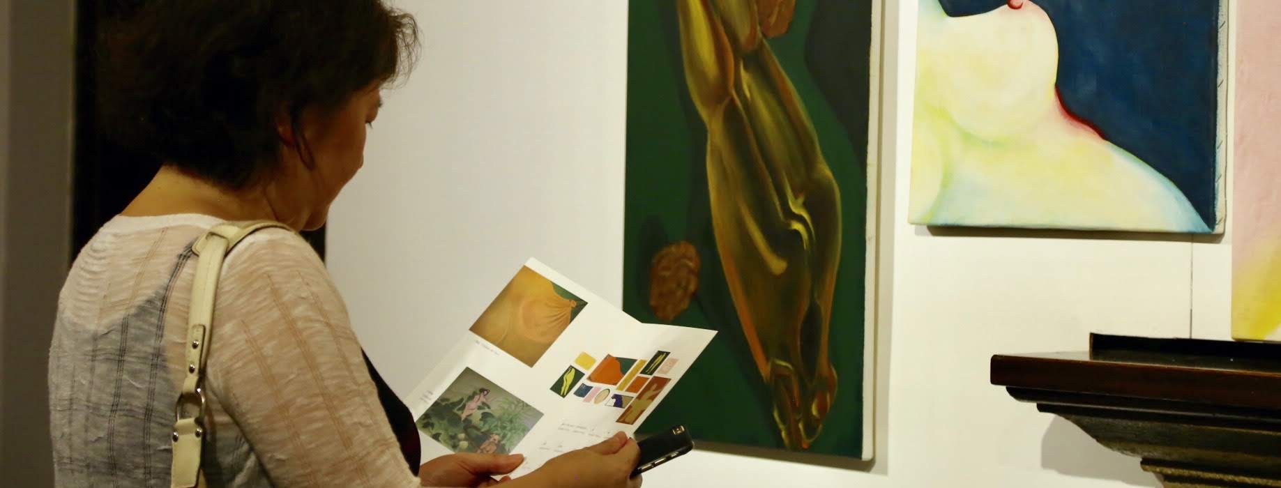
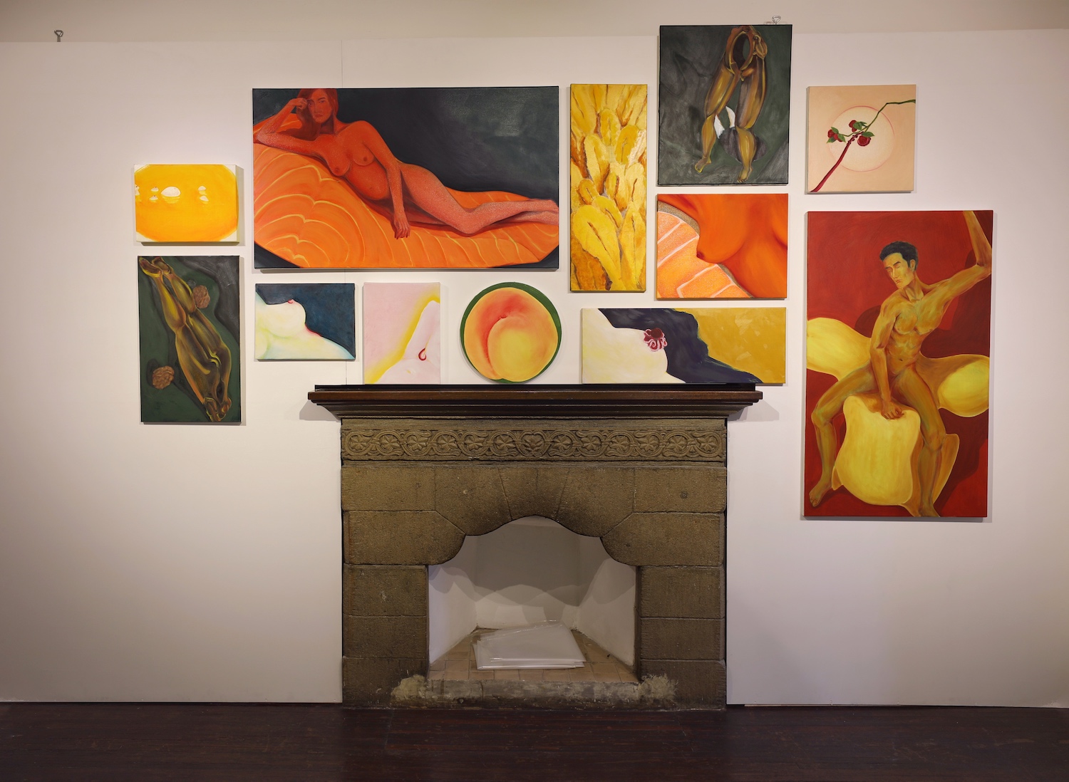
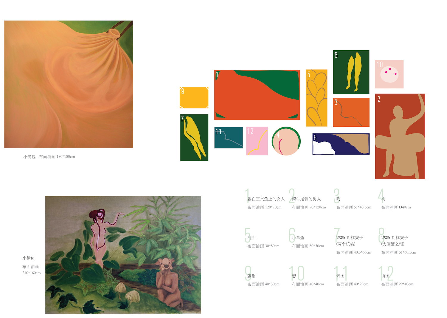
A catalogue was used to provide information on the artworks during the exhibition, as well as to engage the visitors. One of the highlights of the show was a wall (image on the left) displaying a collection of twelve paintings in various sizes. I saw an oppurtunity to bring out the interaction between the visitors and the paintings, therefore I digitally illustrated each painting and displayed them in the same layout as to how they are arranged on the wall (with the artist’s permission and encouragement).
The wall of paintings at the exhibition.The inner spread of the catalogue, illustrating the paintings.
Outcome
All my promotional materials were printed, published and used during the exhibition, which attracted around 300 visitors. Many visitors thought that the way how the exhibition catalogue was designed to mirror the main exhibition wall was an extremely helpful and interesting experience.
Challenges + Insights
The main difficulty I encountered was having to work with Mandarin because I’ve only studied English typography extensively. This project provided me with a rich opportunity to explore this entirely different typographic culture; and it also made me realize how much more I need to learn, especially with Mandarin being my native language.