In an Interaction Design Methods course, each team was tasked to work with an organization for 12 weeks and use various design methodologies to understand the organization’s needs and goals and to eventually create a design solution for them.
The organization we worked with was HUB Cycling, a non-profit that encourages more cycling. The final design solution we created was a digital platform that assists bikers in reporting unsafe biking conditions they encounter on the road, and assists HUB in collecting this data from various bikers all around Metro Vancouver.
We researched on HUB by observing the workers in their natural workspace, attending Regional Advisory Committee meeting and local committee meetings, and volunteering at HUB’s events to gauge their impact in the biking community. These immersive studies eventually helped us to identify design areas that directly linked to the organization’s needs.
We used User Journey Map to visually represent each step an instructor and a student would go through during a HUB’s biking lesson and their thoughts behind them. The User Journey Maps helped us to identify pain points the users would experience and allowed us to explore possible design areas within these areas.
Three personas are developed to empathize with the three possible stakeholders during a HUB’s biking lesson--a parent of a young student biker, an immigrant aspired to be more involved in a community and a biking instructor.
We held a participatory workshop to engage real bikers and their experience on the road as female cyclists.
Throughout the 12 weeks of this project, we explored many different design areas, some key areas that helped shaped our final design focus include:
1. To increase member engagement in local committees.
2. To assist student bikers in transitioning from the completion of their biking lessons to riding on the road. But we learned that even with education, bikers still wouldn’t feel fully comfortable without a safe biking environment.
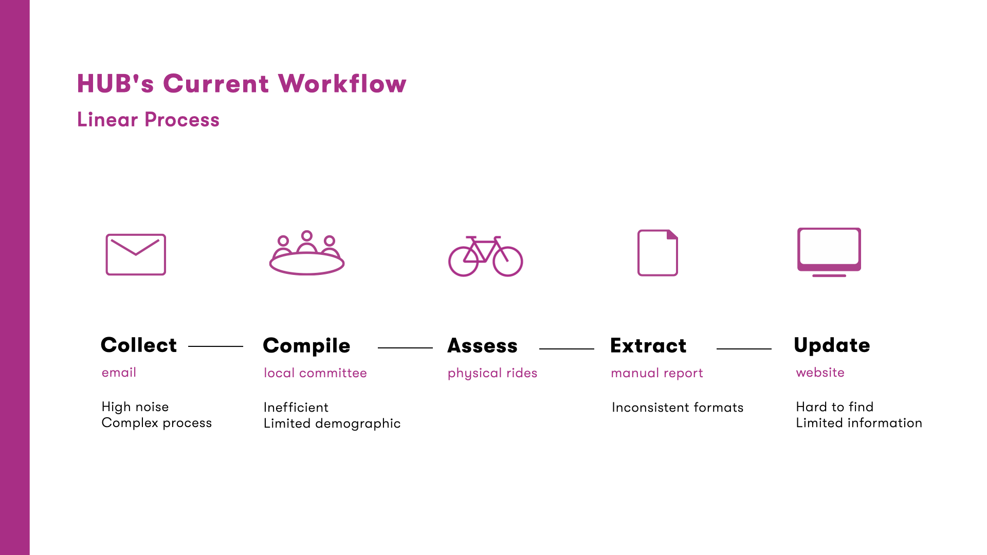
3. To help HUB gain more knowledge on the biking conditions in more areas by engaging a broader biking community because HUB currently lacks “completeness” of covered areas.
An initial concept was to provide a kit that contains several fun family biking challenges for families that wish to engage their children with biking activities after biking lessons. I illustrated and designed a mid-fidelity mockup of the card deck and a storyboard to convey the interaction.
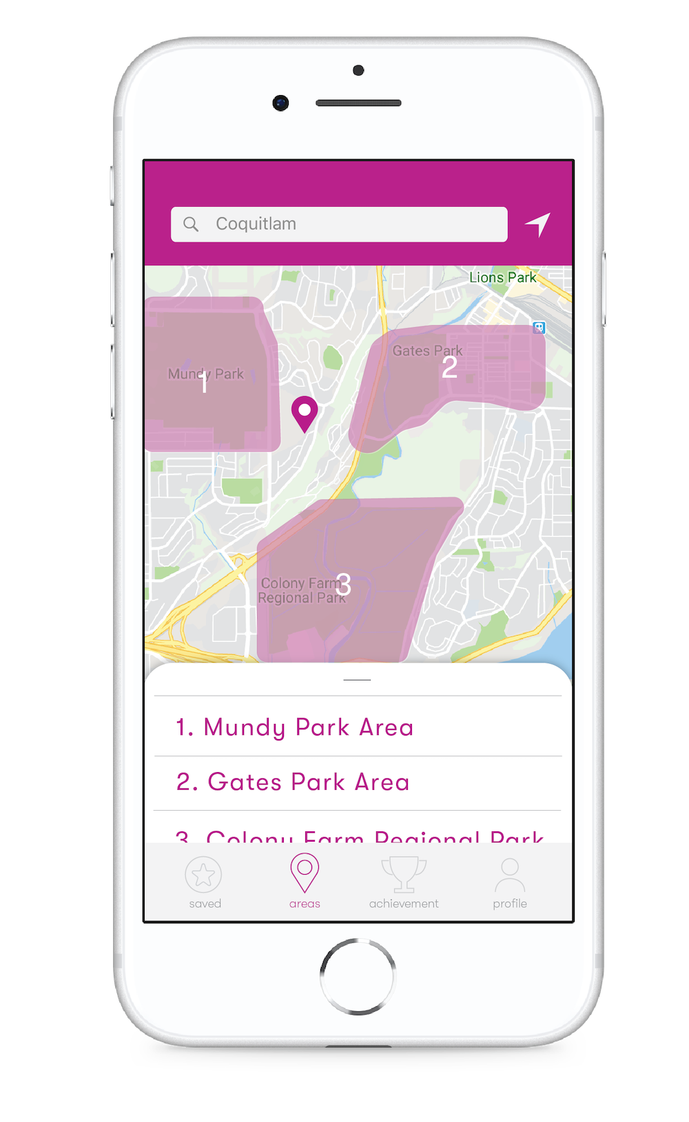
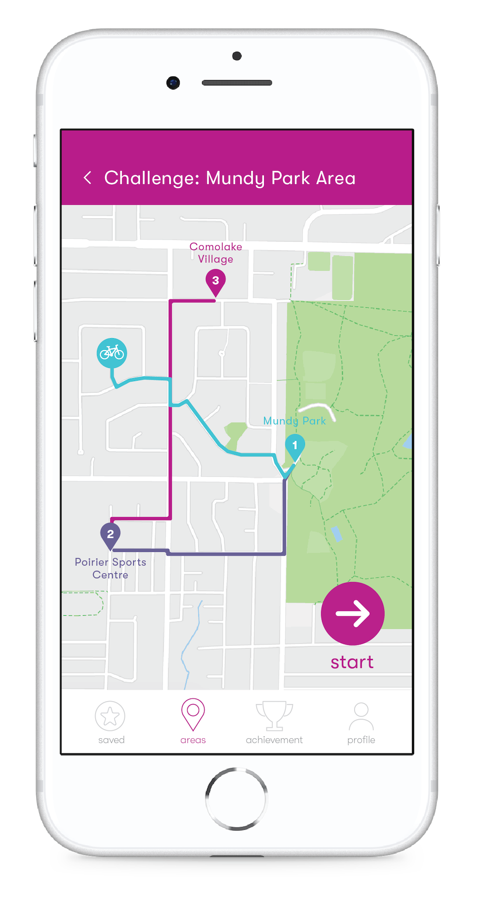
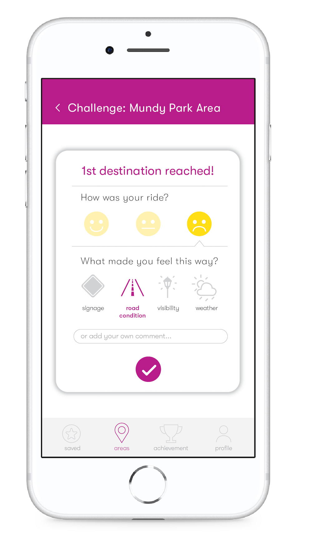
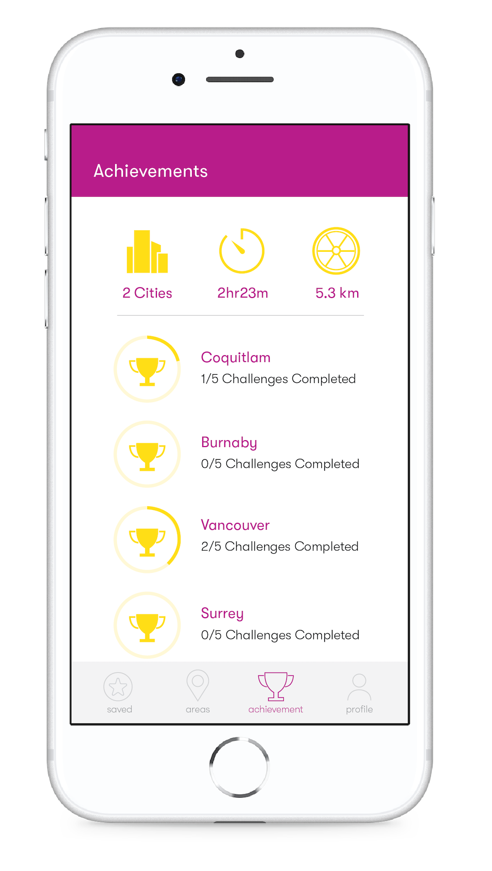
I also co-created a series of low-fidelity UI for an app concept that allows bikers to explore Metro Vancouver by completing various biking challenges in different Cities. However, we decided to pivot from this idea because the challenges lacked incentive for the user.
A major insight we got from interviewing Jeff Leigh, the Chair of the Vancouver Committee, after attending their monthly committee meeting was that each local committee had a heavy workload when advocating for improvement on biking infrastructure. We concluded that HUB’s current workflow is inefficient and linear, and we identified 5 main stages of the process -- collect, compile, assess, extract and update.
Our final app solution closed the loop of their workflow by keeping all HUB members updated with all progresses made by HUB and improved each stage to make the whole experience more accessible and cohesive.
Our final design solution was a mobile app that serves as a tool for both cyclists and HUB staff in the process of helping to improve biking conditions in Metro Vancouver.
The onboarding process gives the user an overview of what the app offers. It also highlights how users’ contribution will be helping HUB's political agenda of improving the cycling conditions in Metro Vancouver.
After the cyclist captures a problem encountered on the road using one of our explored capture mechanism (tapping on earphones, pressing on volume button etc.), they will be prompted to enter the app to annotate and report the problem.
To compile the data collected, the “voting system” in the app would help convert noise to signal and prioritize reports. In the Map tab, cities are ranked according to the upvotes they receive. The colours on the ring around the number of problems identified in an area represent different types of problems -- visibility, road condition, signage and bike lane.
This feature is exclusively for HUB’s local committee staff, allowing them to auto-generate assessment rides based on the problems identified by various bikers. The selected problems would appear in a check-list format for the staff to annotate and check off during their assessment ride. After the ride, HUB staff can extract a report based on their input.
After the assessment ride, a report template is sent to the staff’s email for efficiency. The auto-generated form allows the staff to complete the report by filling out any additional comments. This feature can be used to support HUB’s political agenda since the report incorporates key user data extracted from the app.
The user would be notified if progress has been made regarding the problems that they identified and be directed to the post. This keeps the cyclists in the loop of HUB’s progress and encourages the users from keep reporting.
Our final design solution was a mobile app that serves as a tool for both cyclists and HUB staff in the process of helping to improve biking conditions in Metro Vancouver.
This app offers 2 sets of value propositions for both the cyclists and HUB’s staff.
This project received full mark as a grade and was selected to be presented at the FCAT (Faculty of Communication, Art and Technology) Conference in Spring 2019.
The greatest challenge was to work with an actual organization for 12 weeks. There were times where my team needed to research extensively on our own due to HUB staff’s busy schedule. Yet working with an actual organization taught me the importance of empathizing with the user to better cater to their needs.
UX/UI Design
Visual Design
Co-op Experience, UX/UI Designer